
There is more happening on a faith-based garment than most people realize. The role of typography in faith apparel goes far beyond choosing a font for a Bible verse. It is a visual language, a set of decisions about weight, spacing, and typeface that collectively communicate who you are, what you believe, and how seriously you take both your faith and your aesthetic. For design-savvy Christians who wear Fear of God Essentials and think carefully about what they put on their bodies, typography is the difference between a garment that feels like a statement of identity and one that feels like a church fundraiser remnant.
Table of Contents
- Key takeaways
- The role of typography in faith apparel foundations
- Typography trends shaping faith apparel in 2026
- Typography as theological and personal expression
- Applying typography well in your faith apparel choices
- My take on typography and faith identity
- Faith apparel that gets typography right
- FAQ
Key takeaways
| Point | Details |
|---|---|
| Typography shapes theology | Font weight, contrast, and placement perform doctrinal work, not just decorative function. |
| Modern Christians want restraint | Design-savvy believers aged 15-34 prefer sharp, badge-like typography over conventional Christian merchandise aesthetics. |
| Font personality matters | Serif fonts read as formal and serious; sans-serifs feel modern and approachable, directly affecting theological tone. |
| Placement is a form of respect | Sacred text should avoid crease-prone areas and be verified for accuracy before going to print. |
| Subtlety starts conversations | Faith apparel that balances clarity with quiet design invites dialogue rather than broadcasting a message. |
The role of typography in faith apparel foundations
Typography is not neutral. Every decision you make about a typeface carries emotional and theological weight, even when it appears invisible on the surface.
The basic building blocks are worth understanding clearly. Weight refers to how thick or thin the strokes of a letterform are. Contrast describes the variation between thick and thin strokes within a single character. Placement determines how text sits on the garment, whether centered and declarative, offset and understated, or stacked in a way that creates visual rhythm. Together, these elements create tone. A heavy condensed sans-serif set in all-caps reads as bold declaration. A light, widely-tracked serif reads as meditative and quiet.

Font choice dictates brand identity and emotional response, with the right typeface conveying either professionalism or casual playfulness. In faith apparel specifically, that emotional register is inseparable from theological tone. A brand using a heavy block serif to print Genesis 1:26 is making a different statement than one using a thin, closely tracked grotesque. Both are valid. Neither is accidental.
The importance of typography in apparel becomes most clear when you compare readability against aesthetic balance. A verse printed in a decorative script may honor the text emotionally but fail the wearer practically if it cannot be read from a normal distance. The goal is not simply legibility. It is that rare combination where the letterform and the message feel like they were made for each other.
- Weight signals conviction. Heavier type implies certainty and authority.
- Tracking (letter spacing) signals breathing room. Wider tracking reads as calm and considered.
- Typeface category signals cultural register. Geometric sans-serifs read contemporary; old-style serifs read classical.
- Placement signals intent. Chest-centered text declares; sleeve or hem text suggests.
Pro Tip: Before committing to a typeface for faith apparel, print a physical proof and wear it. How a font reads on screen and how it reads on fabric at arm’s length are two very different experiences.
Typography trends shaping faith apparel in 2026
The current typography moment in faith apparel is one of quiet sophistication. The loud, gradient-heavy lettering of early 2000s Christian merchandise has largely given way to something more considered.
Experimental variable fonts and quiet sans-serifs are the dominant trend in apparel typography for 2026, favored for their professionalism and minimal visual clutter. Variable fonts are particularly interesting in this space because they allow a single typeface to carry a range of weights and widths within one file, giving designers the ability to find exact tonal precision rather than defaulting to preset weights.
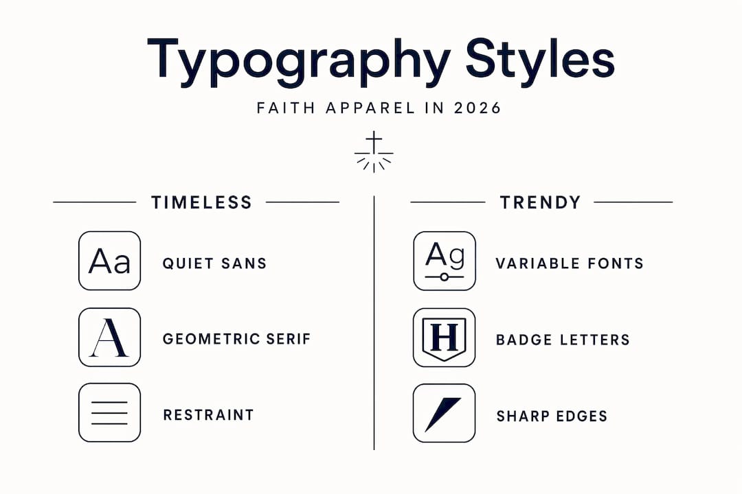
Design-savvy Christians aged 15-34 prefer modern, badge-like, sharp typography in faith apparel, actively moving away from conventional Christian merchandise aesthetics. This mirrors broader streetwear typography trends, where brands like Honor The Gift use stark, utilitarian type that feels more archival than decorative. The theological parallel is significant. Stripping away ornament can be an act of reverence, not reduction.
| Typography Style | Emotional Register | Best For |
|---|---|---|
| Heavy geometric sans-serif | Bold, confident, declarative | Short phrases, single scripture references |
| Light extended grotesque | Quiet, meditative, modern | Long-form verses, layered garment text |
| Contemporary serif | Serious, timeless, grounded | Brand names, foundational scripture |
| Variable font (condensed) | Versatile, urban, intentional | Badge logos, capsule collections |
Faith apparel design trends also reflect generational difference in how believers want to present themselves. Older audiences tend toward traditional serif type that carries the visual gravity of printed Scripture. Younger wearers often reach for the same clean, cropped typography they see across premium streetwear. Understanding that range helps any designer or buyer make choices that feel authentic to the wearer rather than generic to the category.
Typography as theological and personal expression
There is a word worth borrowing from academic study here: semiotic. Typography in faith apparel functions as a semiotic system where weight, contrast, and font choice perform doctrinal labor, shaping how a message is interpreted and how authority is distributed.
Consider what happens when you bold a single word in a scripture reference. You are not just adding visual weight. You are making an editorial decision about what matters most in that passage. 73% of scripture shared on social platforms employs non-standard formatting, predominantly bold, to assert theological priority and command attention. The same logic applies to garments. When Human By God prints “Always Seen. Always Covered.” in a clean, single-weight grotesque, the absence of bold creates equity between the words. Every word carries identical weight, which is itself a theological statement about completeness.
“Typography in faith apparel is not decoration. It is an argument made quietly, worn publicly.”
Bold typography democratizes textual authority by allowing everyday believers to visually prioritize scripture, disrupting conventional interpretive hierarchies. This is one of the more underappreciated aspects of graphic design in faith apparel. The garment becomes a form of personal exegesis. You are not just wearing a verse. You are presenting a reading of it.
How to apply this thoughtfully:
- Choose a typographic hierarchy that reflects your theological intent, not just what looks good in a mock-up.
- Decide whether the message should declare or suggest. Short, heavy type declares. Light, widely-tracked type suggests.
- Test placement on the actual garment, not just in design software. Chest placement reads differently than a left chest badge or a hem print.
- Verify the scriptural text word for word before sending to print. A single error in sacred text is a serious design failure.
Respectful text placement avoids crease-prone areas and verifies script authenticity to prevent cultural or religious missteps. For Christian apparel specifically, this means thinking carefully about how a garment moves, folds, and ages. Sacred text printed across a seam or a pocket edge loses both legibility and dignity over time.
Pro Tip: When using Scripture in apparel, include the reference in a secondary, smaller typographic element. It anchors the text without over-explaining it, and it gives curious people a place to look.
Applying typography well in your faith apparel choices
Good typography in faith apparel is not about complexity. It is about clarity of intention. The most successful pieces in this space tend to share one characteristic: everything on the garment is there for a reason.
Effective faith apparel balances clear verses, readable fonts, and subtle styling to create conversation starters rather than preachy novelties. That phrase, “conversation starters,” is doing a lot of work. It implies that the garment should open a door, not close one. Type that shouts leaves no room for dialogue. Type that whispers invites it.
Practical guidance for making better typography choices in faith apparel:
- Limit your typefaces. One typeface in two weights is almost always more effective than two different typefaces competing for attention. The best fonts for print are ones that feel invisible until you look closely.
- Match the type to the message tone. If the verse is one of reassurance, use a lighter weight. If it is one of declaration, let the type carry that conviction.
- Consider the garment’s use context. A gym hoodie and an office-ready cap call for different typographic registers.
- Avoid over-decoration. Outlines, drop shadows, and gradient fills on scripture text almost always undermine the message rather than support it.
- Involve the wearer in the design when possible. Design-savvy youth balance faith and trend by participating in typography choice, creating more confident and authentic wear.
The role of typography in children’s faith wear follows similar principles but with added considerations around legibility at small sizes and the durability of print methods over repeated washing. For kids’ pieces, bolder weights, larger point sizes, and simpler typefaces consistently outperform intricate type choices in both readability and longevity.
My take on typography and faith identity
I’ve spent time studying what separates faith apparel that genuinely resonates from the kind that ends up folded at the back of a drawer. The answer, almost every time, comes down to typography.
Conventional Christian merchandise often approaches typography as a vehicle for the message, not as part of the message itself. That distinction matters more than most brands acknowledge. When the type feels generic or borrowed, it signals that the design decision was made on autopilot. Wearers can feel that, even if they cannot articulate it.
What I’ve found actually works is restraint paired with specificity. Not minimal for the sake of it, but minimal because every element that remains on the garment is there with intention. Human By God does this well. The typography on their pieces doesn’t announce itself. It settles. You wear it through the week and it becomes part of how you carry yourself.
The typography styles used for inspirational clothing that endure are the ones that feel personal without being precious, and theological without being academic. That balance is difficult to strike. Most brands err too far in one direction. The ones that get it right understand that the wearer’s relationship with the text is more important than the designer’s relationship with the typeface.
— H
Faith apparel that gets typography right
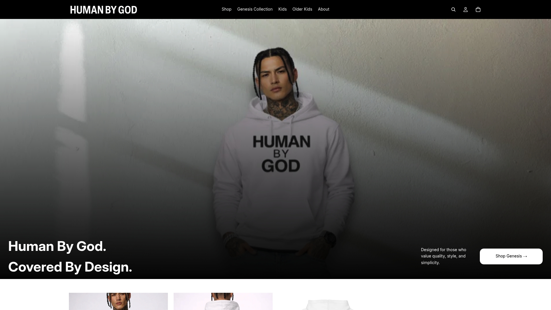
Human By God was built around the conviction that faith expression and design excellence are not in tension. The brand’s caps, hoodies, and tees carry print design principles that prioritize typographic precision and theological intentionality over trend-chasing. The Genesis Cap features quiet, badge-like lettering that sits comfortably next to any premium piece in your wardrobe. The embroidered hoodie collection uses clean, color-coordinated type that communicates “Watched Over. Built Different.” with the kind of stillness a garment should have when it carries something sacred. If you want faith apparel that treats typography as a design decision rather than an afterthought, the Genesis Cap is a strong starting point. Everything is considered. Nothing is accidental.
FAQ
What is the role of typography in faith apparel?
Typography in faith apparel shapes how a message is communicated, perceived, and felt. Font weight, typeface choice, and placement all influence whether a garment feels like a declaration, an invitation, or a personal reminder.
How does font choice affect the tone of religious clothing?
Serif fonts read as formal and serious while sans-serifs feel modern and approachable, which directly affects how the theological message on a garment is received by both the wearer and the observer.
What typography styles work best for inspirational clothing in 2026?
Variable fonts and quiet geometric sans-serifs currently lead faith apparel design trends, offering visual clarity and professional restraint that appeals to design-conscious believers.
How do you avoid making faith apparel look preachy?
Keep typographic hierarchy simple, favor lighter weights for longer text, and resist the urge to decorate. Effective faith apparel creates space for the message rather than forcing it on the viewer.
Does typography matter differently in children’s faith wear?
Yes. The role of typography in children’s faith wear prioritizes legibility and print durability. Bolder weights, simpler typefaces, and larger text sizes consistently perform better on kids’ garments across repeated wear and washing.