

Scripture typography apparel is faith-inspired clothing that uses Bible verses and references as the primary visual element, rendered through considered typographic choices rather than illustrated graphics. The industry term for this design category is devotional typography clothing, though scripture typography apparel has become the working phrase among designers and consumers alike. Fonts like Helvetica and Futura dominate the minimalist end of this category, producing clean, contemporary results that sit comfortably alongside premium streetwear. For the 18 to 35 demographic, this approach resolves a real tension: wearing faith without performing it.
What makes scripture typography apparel examples work
The most effective scripture typography apparel examples share one quality: the design does not fight the message. When the typography is right, the verse lands. When it is wrong, the garment looks like a church bulletin.
Sans-serif fonts like Helvetica, Futura, and Neue Haas Grotesk produce the contemporary minimalist look that resonates with younger wearers. They strip away historical ornament and let the words carry weight on their own terms. Serif fonts, by contrast, signal tradition and doctrinal authority. Script fonts feel personal and relational but sacrifice legibility at small sizes.

Placement is as deliberate as font choice. Short phrases and single-verse references work on the chest or left pocket area, where the eye lands first. Longer passages belong on the back, where there is room for typographic hierarchy to separate the verse text from the citation. Treating the scripture reference as a distinct typographic object, smaller and set apart, allows a reader to parse meaning quickly without crowding.
Negative space is not emptiness. It is structure. High contrast between text and fabric, black on white or white on black, maximizes scripture legibility and gives the design room to breathe. Gold text on dark fabric adds weight without loudness.
Pro Tip: If a verse requires more than two type sizes to read clearly, the design is overcrowded. Reduce the verse length before reducing the font size.
10 scripture typography apparel examples worth studying
1. The oversized chest block print
A single short verse set in all-caps Futura, centered on the chest of an oversized heavyweight tee. No illustration, no secondary graphic. The verse fills the space with authority. Psalm 46:10, “Be still,” works well here because the brevity matches the restraint of the design. Human By God’s approach to organic oversized tees follows this logic exactly.
2. The left-chest pocket verse
A four to six word phrase set in a light-weight sans-serif, positioned at the left chest like a brand logo. Genesis 1:26 rendered in 14pt Helvetica Light reads as identity, not announcement. The understatement is the point. This format works on both tees and hoodies.
3. The full-back passage print
Longer verses like Romans 8:38 to 39 need space. A full-back print in a clean serif like Garamond, with the citation set smaller and right-aligned at the base, gives the passage room to be read rather than scanned. The typographic hierarchy here is critical: verse body in one weight, reference in another, nothing competing.
4. The tonal monochrome hoodie
White text on an off-white or cream hoodie, where the contrast is intentionally low. The verse is present but quiet. Isaiah 41:10 in a condensed sans-serif across the back reads as texture from a distance and as text up close. This format rewards proximity. It invites curiosity rather than broadcasting.
5. The stacked reference column
A vertical stack of scripture references without the verse text itself. Philippians 4:13, John 3:16, Romans 5:8, set in a narrow column on the left sleeve or along the back yoke. The design assumes the wearer knows the verses. It functions as a personal catalog, not a sermon.
6. The bold streetwear back print
Modern Christian streetwear draws directly from hip-hop and skate aesthetics. A back print in a bold extended sans-serif, set at 72pt or larger, with a verse like Proverbs 3:5 broken across three lines. The scale makes it graphic. The content makes it devotional. Streetwear brands have shown that bold typography and urban style can carry theological weight without losing cultural credibility.
7. The sleeve stamp
A single scripture reference printed vertically along the left sleeve, as if stamped. No verse text, just the citation in a condensed grotesque. This format borrows from workwear and military apparel. It is quiet, specific, and personal. It works best on heavyweight fleece or canvas-weight fabric.
8. The tonal embroidered verse
Embroidery in a matching thread color on a structured cap or hoodie chest. Ecclesiastes 3:1 in a small serif, stitched in navy on navy or black on black. The texture is visible in direct light and invisible from a distance. This is scripture as craft, not print. The material quality of premium fabric matters here because the embroidery reads differently on cheap cotton than on a structured fleece.
9. The split-layout tee
The verse is split across the front and back. The front carries the first half of the verse in a light sans-serif. The back carries the second half and the citation. Jeremiah 29:11 works well because the structure of the verse supports the split. The design creates a physical experience of reading, front to back.
10. The minimalist cap text
A six to eight word verse set across the front panel of a structured cap in a single-color embroidery. No logo, no secondary text. “Always Seen. Always Covered.” in a clean grotesque, centered on the panel. Human By God uses this format to ground the wearer’s identity in Genesis 1:26 without any visual noise. The role of typography in this format is to disappear into the garment, not to perform.
Pro Tip: Short verses under eight words are the most versatile. They work on caps, chest prints, and sleeve stamps without requiring layout adjustments.
How font choice shapes the tone of scripture apparel
Typography is not neutral. Every font carries a cultural memory, and that memory shapes how a verse is received before the words are read.
| Font style | Perceived tone | Best use case |
|---|---|---|
| Sans-serif (Helvetica, Futura) | Modern, minimalist, confident | Chest prints, caps, everyday streetwear |
| Serif (Garamond, Times) | Traditional, authoritative, reverent | Full-back passages, formal apparel |
| Script (Playfair Display Italic) | Personal, relational, decorative | Short phrases, pocket prints |
| Condensed grotesque | Urban, direct, bold | Streetwear back prints, sleeve stamps |
Sans-serif supports minimalism and contemporary spirituality. Serif fonts carry the weight of centuries of printed scripture. Script fonts feel intimate but reduce legibility at small sizes, which is why they belong on short phrases rather than full passages.
The risk with script is over-styling. A verse set in a heavily flourished script reads as decoration first and scripture second. The font category drives tone, and tone determines whether the garment feels like a wearable conviction or a piece of wall art that someone decided to put on a shirt.
Longer passages require the most discipline. Hierarchical text treatment separates the verse body from the citation, using size, weight, or spacing to guide the eye. Without that structure, a full-back passage becomes a block of text that no one reads.
Current trends in scripture apparel for everyday wear
The most significant shift in faith-based apparel over the past three years is the move away from graphic illustration toward pure typography. The verse is the design. Nothing else is needed.
Several patterns define where this category is heading:
- Oversized silhouettes with restrained text. The garment is large; the typography is small. The contrast between scale and subtlety is intentional. It mirrors how faith operates in daily life: present, grounding, not announced.
- High contrast color blocking. Black on light shirts and white on dark shirts remain the standard for legibility. Gold on black is gaining ground as a premium option that reads as considered rather than flashy.
- Unisex sizing and premium construction. Lightweight cotton and inclusive sizing from Small through 5XL signal that faith apparel is no longer a niche category. It is everyday wear built for real bodies.
- Theological depth over surface sentiment. Verses like Genesis 1:26 or Romans 8:1 carry more weight than phrases like “be kind” or “love wins.” The balance of theological depth with design simplicity is what separates considered scripture apparel from motivational merchandise.
- Streetwear integration. Hip-hop and skate culture aesthetics continue to influence scripture print designs, with bold extended fonts and back-heavy layouts borrowed directly from contemporary fashion. This is not compromise. It is fluency.
The brands doing this well, including Human By God, understand that the wearer’s faith does not need to be explained by the garment. The garment simply needs to be good enough to wear every day.
Key takeaways
The most effective scripture typography apparel combines sans-serif fonts, deliberate placement, and typographic hierarchy to make faith wearable without making it loud.
| Point | Details |
|---|---|
| Font choice drives tone | Sans-serif reads modern; serif reads traditional; script reads personal but risks legibility. |
| Placement follows verse length | Short verses belong on the chest or cap; longer passages work best on the back. |
| Hierarchy separates verse from citation | Treating the scripture reference as a distinct typographic object improves readability. |
| High contrast maximizes legibility | Black on light fabric and white or gold on dark fabric are the most readable combinations. |
| Restraint is the design principle | The best examples use negative space and minimal text to let the verse carry the weight. |
What I’ve learned from watching this category grow
Faith apparel used to announce itself. The louder the graphic, the clearer the signal. That era is ending, and I think it is ending for a good reason.
The 18 to 35 generation does not want to wear a billboard. They want to wear something that reflects who they are, including the part of them that is rooted in Scripture, without turning every interaction into a conversation about it. The shift toward minimalist scripture fashion is not a retreat from faith. It is a more honest expression of it.
What I find most interesting is how typography has become the primary tool for this. The choice between Helvetica and a decorative script is not just aesthetic. It is theological. One says: this is who I am, plainly. The other says: this is something I want you to notice. The first is harder to design well and more powerful when it works.
The brands getting this right are the ones treating scripture with the same care a book designer gives to a text page. The verse deserves that respect. So does the person wearing it. When the design is quiet enough to invite a question rather than deliver a statement, it is doing something that a louder garment never could.
The everyday outfit question for a faith-rooted person is not “how do I show my faith?” It is “how do I live it?” Good typography on good fabric is one small, honest answer.
— H
The Genesis Collection from Human By God
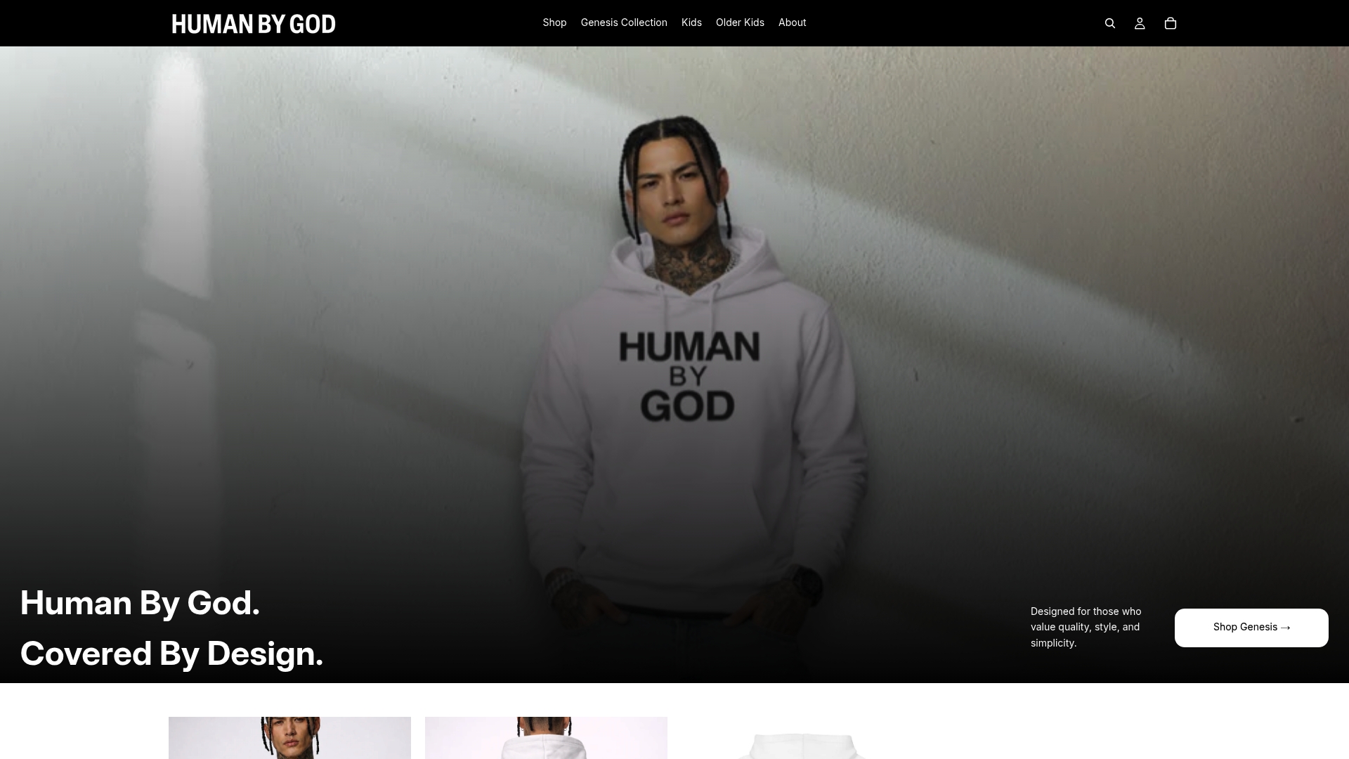
Human By God’s Genesis Collection is built around the principles covered in this article: clean sans-serif typography, considered placement, and premium construction that holds up to daily wear. The collection includes tees, hoodies, and caps, each carrying scripture from Genesis 1:26 in a format that is quiet enough for the office and grounded enough for the gym. Sizing runs inclusively across the full range, and the fabric weight is chosen for longevity rather than cost reduction. If you want to see what minimalist scripture apparel looks like when the design decisions are made with care, the Genesis Collection is the place to start. Explore the full hoodie range alongside it.
FAQ
What fonts work best for scripture apparel?
Sans-serif fonts like Helvetica and Futura produce the most contemporary results for scripture apparel, while serif fonts like Garamond suit traditional or formal designs. Script fonts add a personal feel but reduce legibility at small sizes.
Where should a Bible verse be placed on a shirt?
Short verses under eight words work best on the chest or left pocket area. Longer passages belong on the back, where typographic hierarchy can separate the verse text from the scripture citation.
What is the difference between devotional typography clothing and graphic Christian tees?
Devotional typography clothing uses the verse itself as the visual design, with no illustration or secondary graphic. Traditional Christian graphic tees typically combine illustrated imagery with text, making the typography secondary to the image.
How do I style scripture apparel without it looking preachy?
Choose garments with restrained typography, high-quality fabric, and minimal color contrast. A verse set in a light sans-serif on a neutral tee reads as personal conviction rather than public announcement.
Are oversized fits standard for modern scripture shirts?
Oversized silhouettes are the dominant fit in contemporary faith-based streetwear, reflecting broader trends in premium casual wear. Brands targeting the 18 to 35 demographic consistently favor relaxed, unisex cuts over fitted styles.